JUL, 2025
Praxis Aisa
Improved an existing landing page by identifying usability issues and redesigning key interactions to enhance user experience, information hierarchy. This project was done as part of my internship at Lopez Design.
INTERNSHIP
LANDING PAGE
ROLE
Web Designer
TEAM
1 PM, 1 VD, me
TIMELINE
4 days
PLATFORM
Web
Initial Design
-
Lack of clear visual hierarchy causes multiple elements to compete for attention simultaneously.
-
Decorative graphics and mascots overpower important functional content like timers, CTAs, and key information.
-
Several sections feel visually loud, reducing scannability and increasing cognitive load.
-
Generic imagery weakens brand identity and makes the experience feel interchangeable with other event websites.
-
Large text blocks reduce readability and make information harder to consume quickly.
-
Inconsistent component styles and shapes create a fragmented visual language.
-
Border texts and secondary elements feel disconnected from the overall layout and composition.
-
Important actions such as registration and sign-up buttons lack sufficient emphasis and discoverability.
-
Uneven spacing and content distribution make sections feel visually unbalanced.
-
Navigation, footer links, and supporting content have low discoverability due to weak hierarchy and oversized decorative elements.


Shipped Design
-
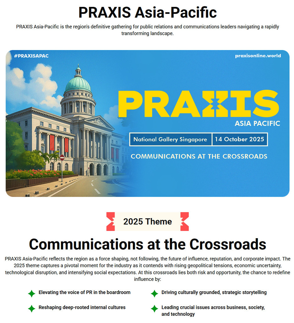
Used dynamic hero content to capture user attention more effectively.
-
Applied chunking to improve content scannability and reduce cognitive load.
-
Highlighted event benefits through a dedicated “Why Attend?” section to increase perceived value and engagement.
-
Updated card shapes to maintain consistency with the overall design language.
-
Used existing components for stronger brand consistency and reduced distractions around the timer section.
-
Refined speaker cards by removing unnecessary graphics for a cleaner and more professional interface.
-
Designed pricing cards to maintain a single point of focus and improve CTA association.
-
Reorganized partner categories to reduce excessive vertical scrolling and improve space efficiency.
-
Redesigned the footer with better spacing and content grouping to reduce visual clutter and strengthen information hierarchy.

Used a more dynamic content for the hero section to catch the user attention
Used chunking to improve content scannability by breaking large text blocks into smaller, digestible pieces of information.

Used existing components for brand consistency and removed mascots to reduce distractions and focus attention on the timer.

The “Why Attend?” section highlights the event’s key benefits, helping users quickly understand its value and encouraging them to engage further.

Updated the card shapes from circular to square to maintain visual consistency with the overall design language of the page.

Refined the speaker cards to maintain visual consistency across the interface and removed unnecessary corner graphics to reduce visual clutter and create a cleaner, more professional layout.

Reorganized the sponsor section into categorized partner groups to reduce excessive vertical scrolling and improve content efficiency, as displaying each category in a separate linear layout was taking up too much space.

Designed the pricing cards to establish a single point of focus at a time, reducing cognitive load and helping users clearly differentiate between ticket options. The CTA was placed inside each card to strengthen the perceived clickability and create a stronger association between the pricing information and the action.

Redesigned the footer to reduce visual clutter by introducing better spacing and clearer content grouping, creating a cleaner and less visually overwhelming layout while maintaining strong information hierarchy.
